Ex 1: Headspace Portrait
An example guide of recreating Basil's Headspace portrait.
Last updated
An example guide of recreating Basil's Headspace portrait.
Last updated
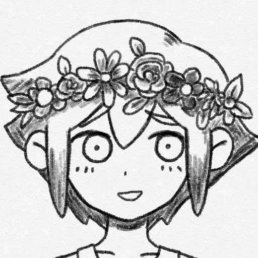
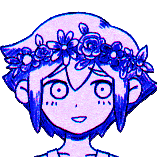
For this we'll be attempting to recreate Basil's portrait as close to the original as possible.
This example is done in Clip Studio Paint. Though this is also possible on Krita and Photoshop as they support all features required.
Here is a quick rundown on general step layout.
For this example, the image is drawn at 512x512, far larger than game sprite of 106x106. This is so the specific brush detail will be "averaged out" later when sized smaller, and allow for more leeway of wobbliness.
Line width is estimated by just sizing the original to also 512x512 and comparing line brush.
Since the goal here is just to recreate for demonstration, the line art will be traced over.
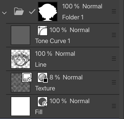
Brush used in example is Pencil R on Clip Studio. At around 6px size.
Texture used is Impasto, a default texture on Clip Studio. Resized slightly smaller at 8% opacity.
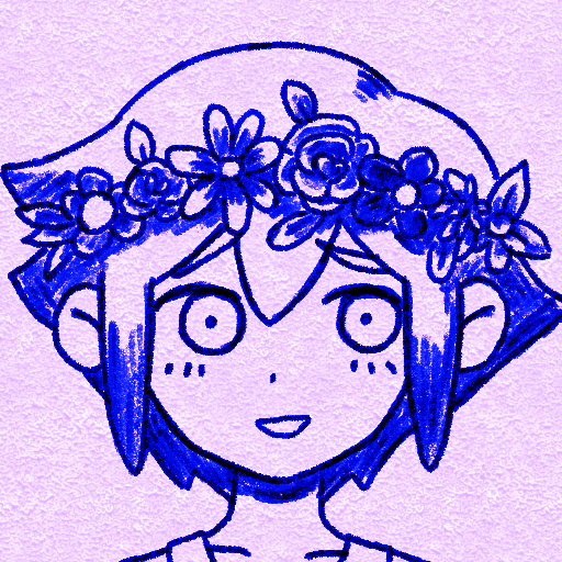
For coloring, tone curve will be used as it's simple but still gives enough control over specific values.
Taking a look at original sprite, notice that the darkest value remains black, changing to blue. With the lighter area being more purple/magenta.
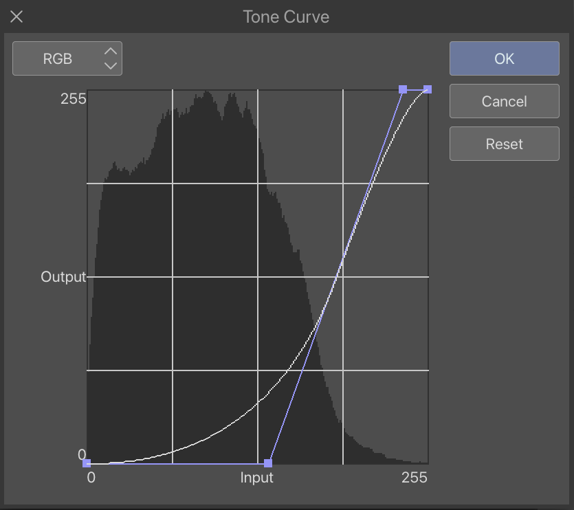
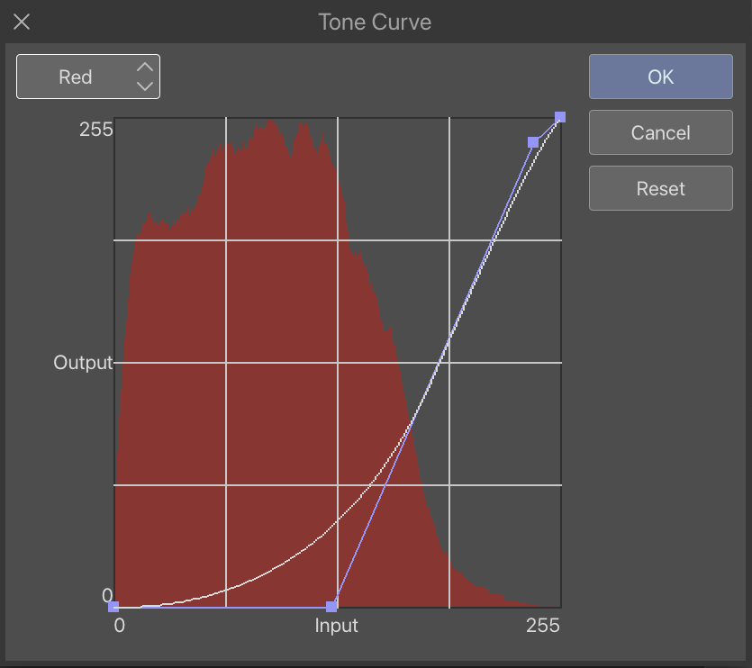
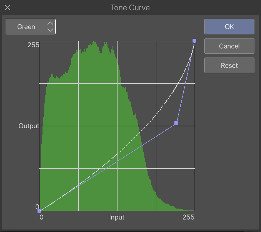
Tone curve here is done in Clip Studio Paint. Here are settings used.
More info can be found here on Tonal Correction Effects.
RGB Channel can be thought of in this case as brightness value. Being 0 = Black to 255 = White.
For this, dark value is made darker to make the black values pop through the other colors and help increase contrast. This is shown as curve pushed down on left to middle.
The bright value is made slightly brighter to increase contrast and reduce the back texture of the paper a little. Not too much, as paper texture is still wanted. This is shown as curved pushed up a little on right side.
This can be done quickly with masking at the end product, magic wand or fill tool with transparent value both works.
Sometimes there may be issue with selection fill, it may be good idea to increase contrast or remove the texture layer temporarily first.
If done grouped in a folder, make sure it is set to Normal blending mode.
Curiously, in Basil's portrait sprite and some other headspace sprites there seems to be slight amount of chromatic aberration. In this case can be seen by slight magenta shade above lines and cyan shade below.
Chromatic aberration gives the sprite a slight more pop with more color variance, though might be annoying to work with.
Chromatic aberration can be quite differing in method in different art program, so it may be better to research about it in your own program case rather than explained here.
In this example, the red channel is offset by 2 pixels upward.
Now that the sprite is done, it is time to resize back to the game file size of 106x106. The interpolation method used here is average colors to give it a smooth look and accurate coloring.
From this point on it might be good idea to do the steps in mass after making multiple sprites already, to avoid taking time to individually resize everytime.
Take a look at original sprite, you may notice how portraits tends to have strange white border around the lines. This is a result from sharpen effect.
Sharpen is used to make the image less blurry making lines more defined. In this case the "blur" is due to resizing.
And it is finished! Here are comparison between original (left) and recreation (right).
To save time on making multiple face, a faceless head template could be made, and have the face variants be added on top later.
Older Omori sprites are all redrawn entirely for every frame, but for more newer sprites, like Basil's battle portraits for console content, the face are split.